Error messages
Error messages should help users understand what went wrong, where the problem is, and how to fix it.
This is especially important for people with disabilities. Clear and helpful error messages are particularly useful for people with cognitive disabilities and those who are neurodivergent.
How to prevent issues
Make your forms easy to understand. This will help avoid errors in the first place.
For example:
- write in clear, plain language
- use hint text where information is required in a specific format
- avoid jargon
When you have written your forms, check the error messages to ensure they're clear and easy to understand.
An error message needs to:
- help the user understand the problem
- tell the user what to do to resolve the problem
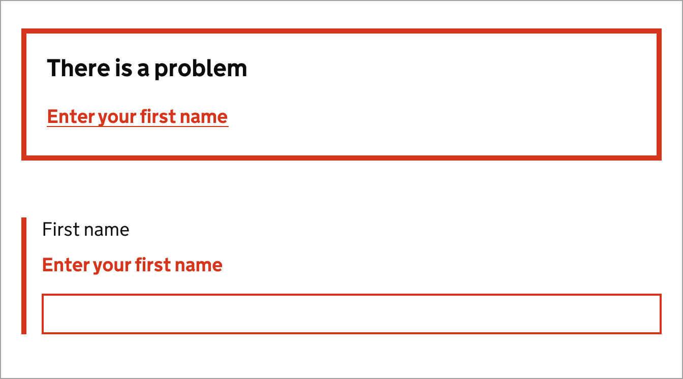
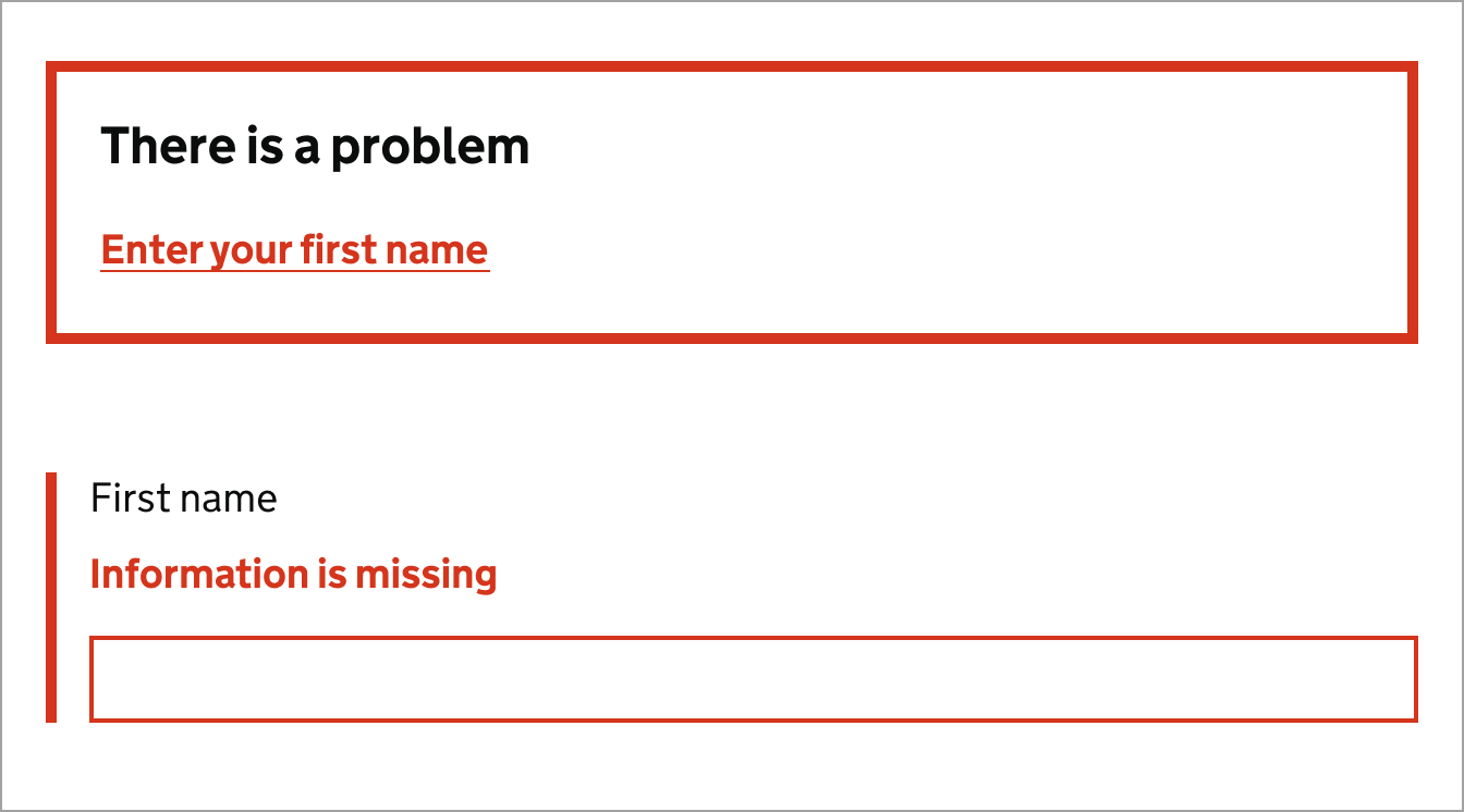
- match against the field input and summary message
- link directly from the summary to the input field with the problem
Clear forms and error messages help users to complete tasks more effectively and without frustration. They also help reduce the chance of poor data getting into DfE systems and services.
Examples of issues in DfE
Below are examples of common issues with error messages and how to avoid them.
Non-descriptive error messages
When a user makes a mistake, it's important to provide them with a clear and concise error message that explains what the problem is and how to fix it. This will help users to understand what they need to do to correct the error and continue with their task.
Do
Use descriptive error messages that explain what the problem is and how to fix it.

Don't
Do not use generic error messages that are ambiguous or don't explain the problem.

Showing errors from a server or database
Sometimes errors are raised from a server or database, these errors are not user-friendly and can be confusing. It's important to catch these errors and provide a clear, user-friendly message.
Do
Use descriptive error messages that explain what the problem is and how to fix it.

Don't
Do not show database generated errors. They can expose information to hackers.

Not linking error messages to the input
Linking the error message in an error summary section to the input makes it easier for users to find and correct the error. This is particularly important for users who are using screen readers, as it helps them to understand which input the error message is referring to.
Do
Link the error message to the ID of the input that has the error.

Don't
Do not use plain text in error messages. It makes it harder to navigate the form.

Mismatched error messages
Error summaries are a list of all the errors on a page. They're usually placed at the top of the page and help users quickly identify and correct any errors they have made.
Error summaries are particularly useful for users who are using screen readers, as they provide a clear and concise list of all the errors on a page.
Do
Ensure the error is linked to the input in error, and is descriptive.

Don't
Do not have different error messages in the summary and against the input.

Resources and guidance
Find more information on forms and error messages using the following resources:
- How to write good questions, NHS Digital(link opens in a new tab).
- Web form design, Nielsen Norman Group(link opens in a new tab).
- Understand error prevention, WCAG 3.3.6(link opens in a new tab).
- Forms guidance, Home Office(link opens in a new tab).

Follow GOV.UK Design System guidance
Use the GOV.UK Design System for the following components and patterns:
Information about this page
- Created
- 12 August 2024
- Last reviewed
- 12 August 2024
- Last updated
- 12 August 2024
- Reason this page exists
- This page exists to help people understand how to prevent introducing common accessibility issues in products and services.
- Suggest a change or comment
- Issue 43

