Images, charts, and alt text
People with a sight impairment or are blind, rely on good alternative descriptions to understand non-text content.
Where images provide information or context to content, they should be given alternative descriptions which describe or provide the same information as a user would receive visually.
How to prevent issues
Where images are more complex, such as graphs, charts or maps, a longer description is required.
In these cases, 2 descriptions should be provided. A short description which explains what the image is, and a longer description which gives more information on the content of the image.
Not all images need a description. If the image is purely decorative, it does not require alternative text. Ensure you use alt=”” so that screen readers will skip these images.
Examples of issues in DfE
Below are examples of common issues with images and how to avoid them.
Wrong alt text
Do
Ensure alt text accurately describes the image.

alt="A teacher standing in front of a class of children who are sitting at desks."
Don't
Do not use the filename or misleading descriptions.

alt="image123"
Charts
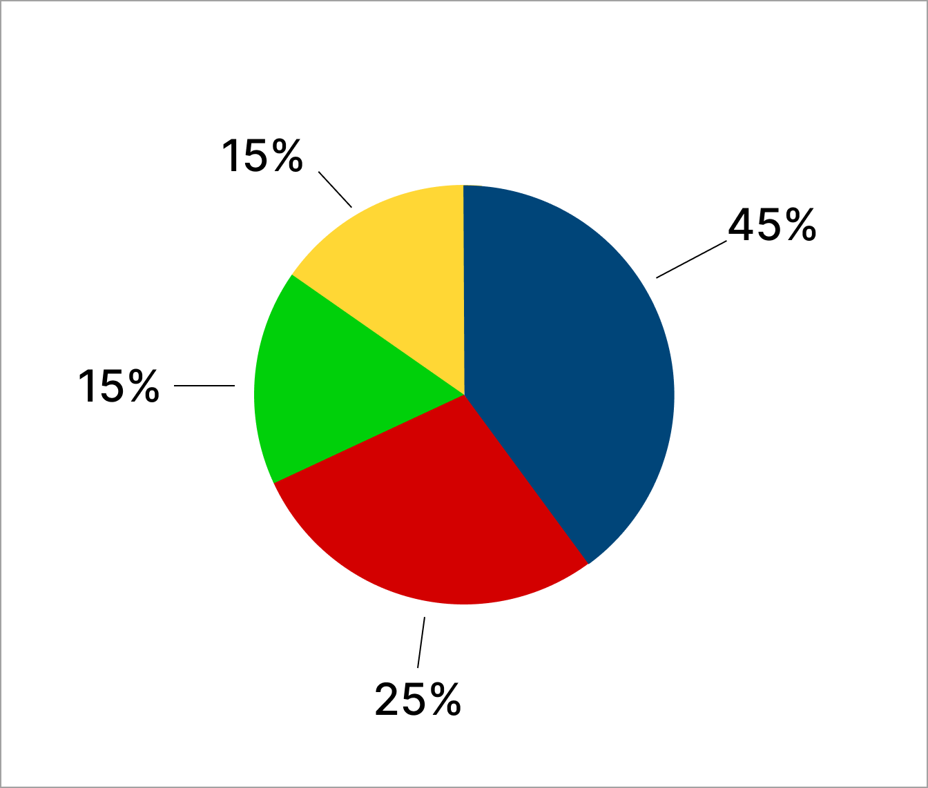
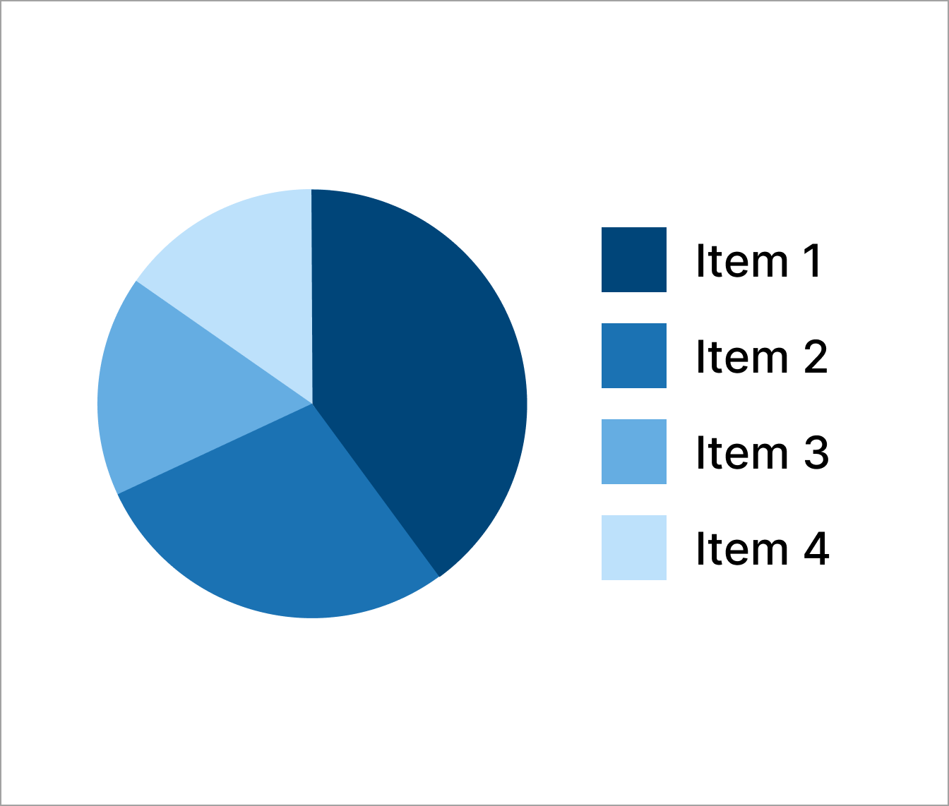
It's also important to ensure that colour alone has not been used to provide information or descriptions. For users with colour deficiencies or colour blindness, this content can often not be understood.
Provide an alternative such as pattern difference or multi-shade colours. Or you could also provide direct labelling within the chart.
Do
Label charts with information and use a range of colours.

Don't
Do not use colour alone to represent data or a label for a chart.


Follow GOV.UK Design System guidance
Use the GOV.UK Design System for the following components and patterns:
Information about this page
- Created
- 12 August 2024
- Last reviewed
- 12 August 2024
- Last updated
- 12 August 2024
- Reason this page exists
- This page exists to help people understand how to prevent introducing common accessibility issues in products and services.
- Suggest a change or comment
- Issue 43

