Use of colour
When used correctly, colour can be an effective way to get information across to users.
When implemented incorrectly, there are multiple ways that use of colour can cause issues for users.
For example, within a chart, if you have provided a key which states, blue represents primary school-aged children, some users will not be able to perceive the colour and therefore link it to the information within the chart.
Examples of issues in DfE
We find a lot of issues relating to colour within services that use campaign sites, charts and graphs, and services that are not using the design system.
Below are examples of common issues with contrast and how to avoid them.
Text contrast
Low text contrast can make content difficult to read, especially for people with sight impairments or colour deficiencies.
Ensure text and background colours have a contrast ratio of at least 4.5:1 for normal text and 3:1 for large text.
You can use a tool such as Contrast Checker to check the contrast ratio of your text and background colours.
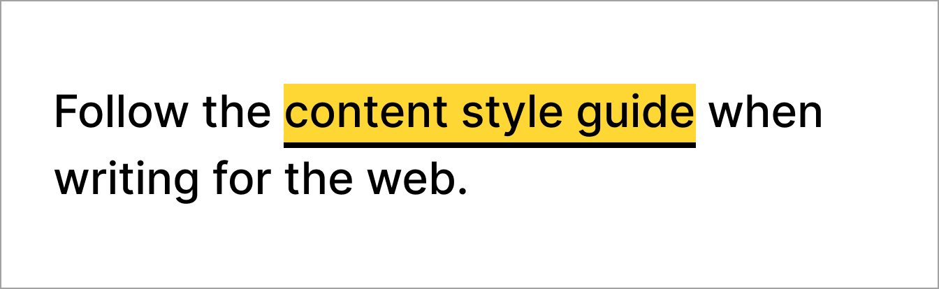
Do
Use foreground and background colours that sufficiently contrast.

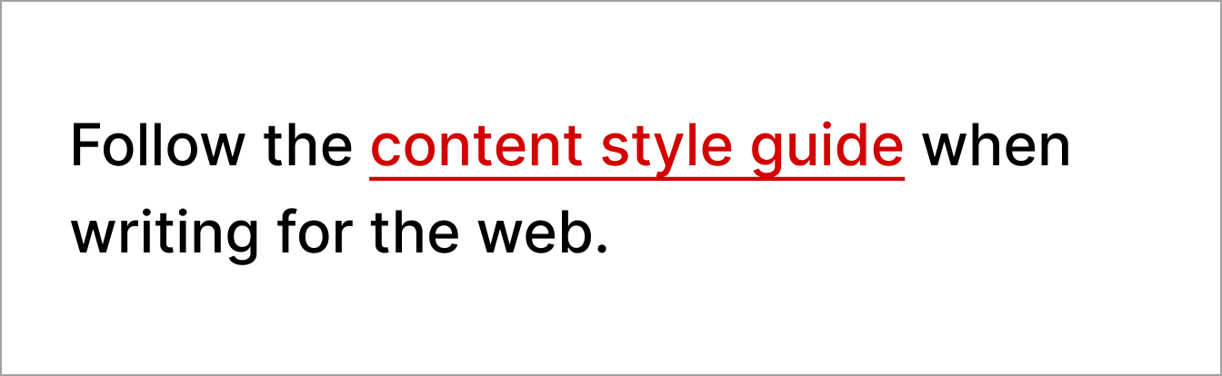
Don't
Do not use light text on pale backgrounds that makes content difficult to read.

Non-text contrast
Checking the non-text contrast ratio on each page of your product or website ensures that users with low vision or a colour deficiency can perceive parts of the screen that may not be text but are still important for accessing and understanding content.
Non-text contrast has a minimum requirement of a 3:1 contrast ratio. You can use the Contrast Checker to check this.
Do
Ensure elements like buttons sufficiently contrast against the page background.

Don't
Do not use colours that make it difficult to identify an element against a background.

Focus state
Focus states help users know they're on an interactive element, like a link or a form input. Focus states are important for people who use a keyboard to navigate, and for people with low vision or a colour deficiency.
If the foreground and background colours do not have enough contrast, users with low vision or a colour deficiency may not see the name of the link.
Changing the style of the focus state when designing services using the GOV.UK Design System and GOV.UK Frontend can confuse people.
Do
Use the default GOV.UK Design System styling for focus states.
Don't
Do not change the colour or style of focus states.
Information about this page
- Created
- 13 August 2024
- Last reviewed
- 13 August 2024
- Last updated
- 13 August 2024
- Reason this page exists
- This page exists to help people understand how to prevent introducing common accessibility issues in products and services.
- Suggest a change or comment
- Issue 43