Common issues
Discover the most common accessibility issues found in DfE digital services and how to fix them.
Many DfE services contain similar accessibility issues. You can avoid many of these issues by following the advice in this guidance and understanding the content and interfaces you design.
We update the issues list below as we identify changes in issues in our products and websites.
Error messages
Clear and helpful error messages are particularly useful for people with cognitive disabilities and those who are neurodivergent.
Follow GOV.UK guidance to create accessible error messages.
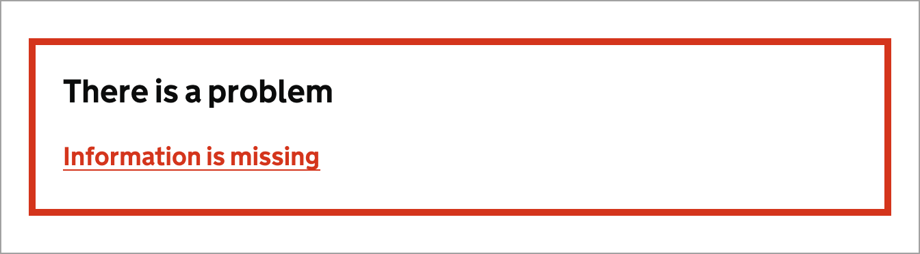
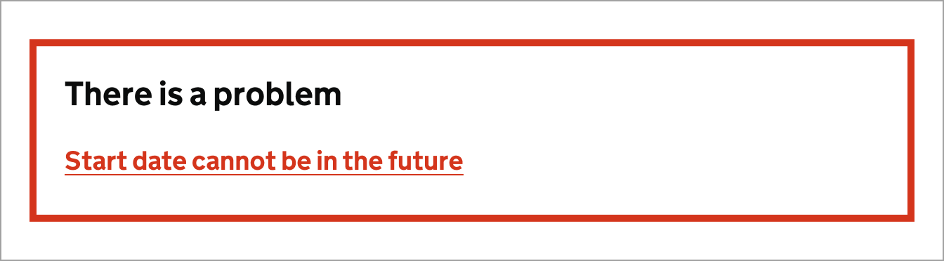
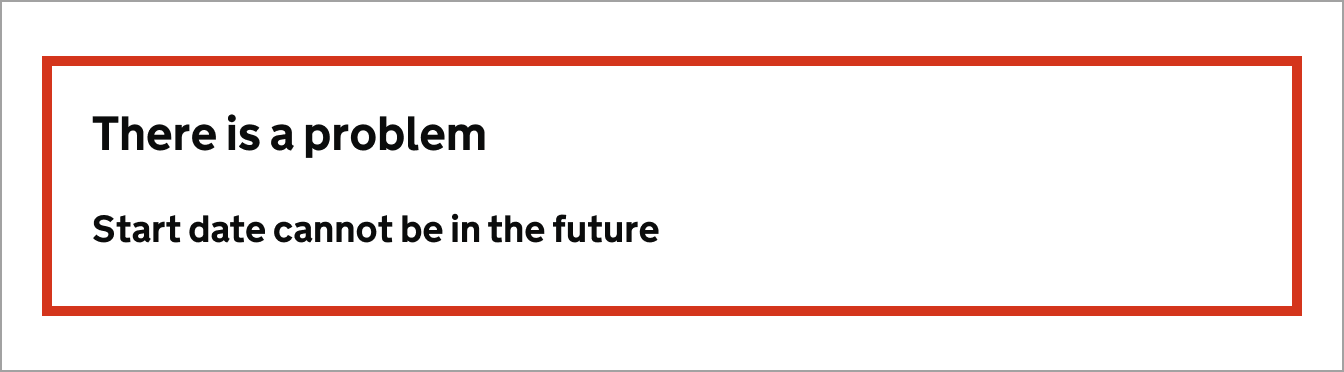
Non-descriptive error messages
When a user makes a mistake, it's important to provide a clear and concise error message that explains the problem and how to fix it. This will help users understand what they need to do to correct the error and continue with their task.
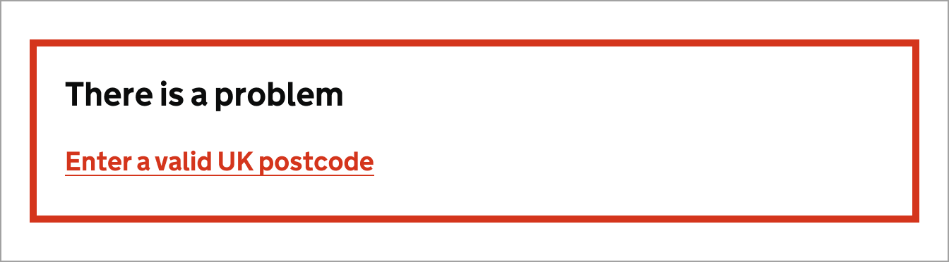
Do
Use descriptive error messages that explain what the problem is and how to fix it.

Don't
Do not use generic error messages that are ambiguous or do not explain the problem.
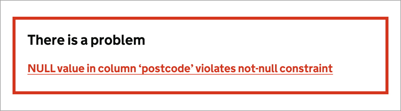
Showing errors from a server or database
Sometimes errors are raised from a server or database, these errors are not user-friendly and can be confusing. It's important to catch these errors and provide a clear, user-friendly message.
Do
Use descriptive error messages that explain what the problem is and how to fix it.
Don't
Do not show database generated errors. They can expose information to hackers.
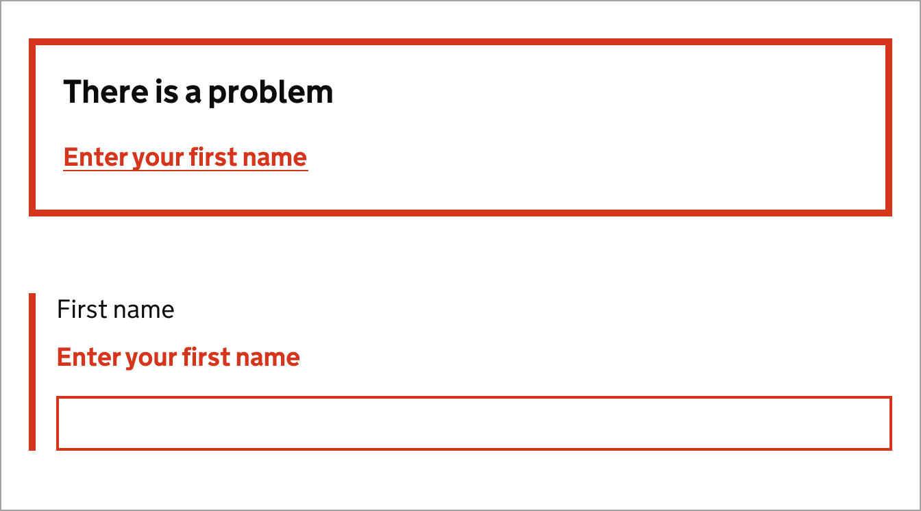
Not linking error messages to the input
Linking the error message in an error summary section to the input makes it easier to find and correct the error. This is particularly important for people who use screen readers, as it helps them to understand which input the error message is referring to.
Do
Link the error message to the ID of the input that has the error.
Don't
Do not use plain text in error messages. It makes it harder to navigate the form.
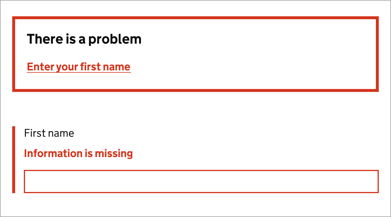
Mismatched error messages
Error summaries are a list of all the errors on a page. They're usually placed at the top of the page and help users quickly identify and correct any errors they have made.
Error summaries are particularly useful for users who are using screen readers, as they provide a clear and concise list of all the errors on a page.
Do
Ensure the error is linked to the input in error, and is descriptive.
Don't
Do not have different error messages in the summary and against the input.
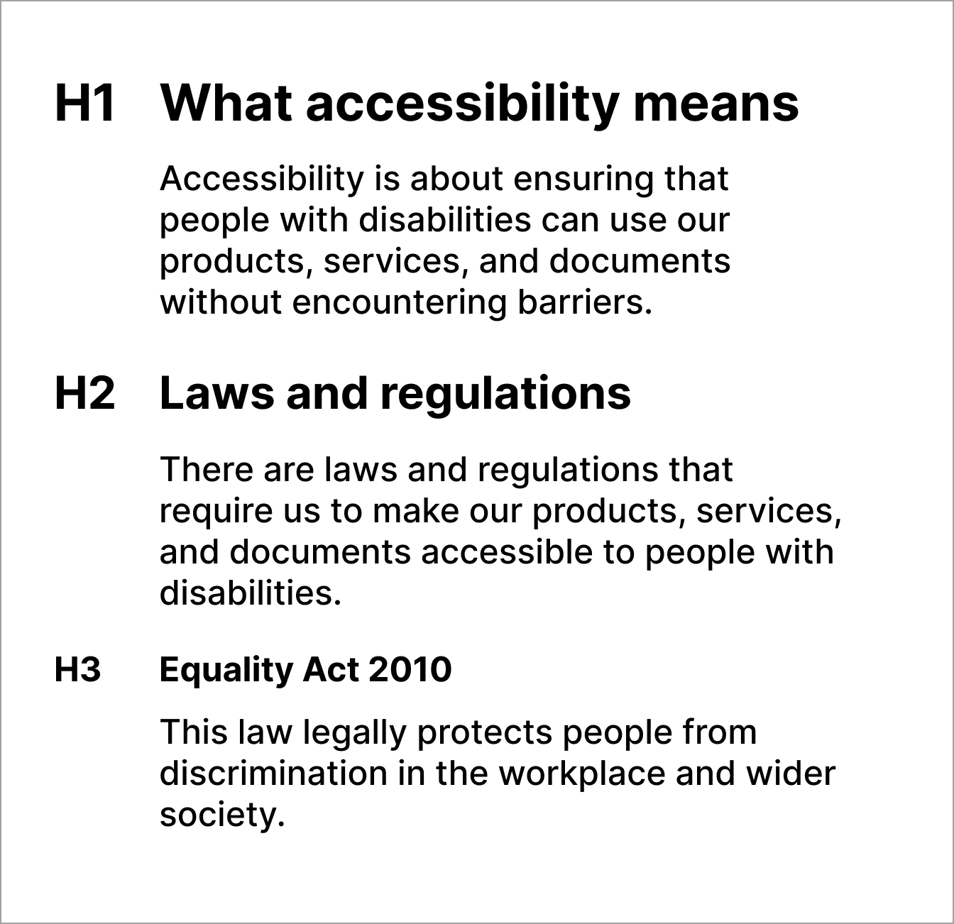
Heading structure
Headings should be used to create a logical structure for content. This helps users to understand and navigate content more easily.
Follow GOV.UK guidance to create accessible headings.
Check the structure of your pages with the HeadingsMap tool.
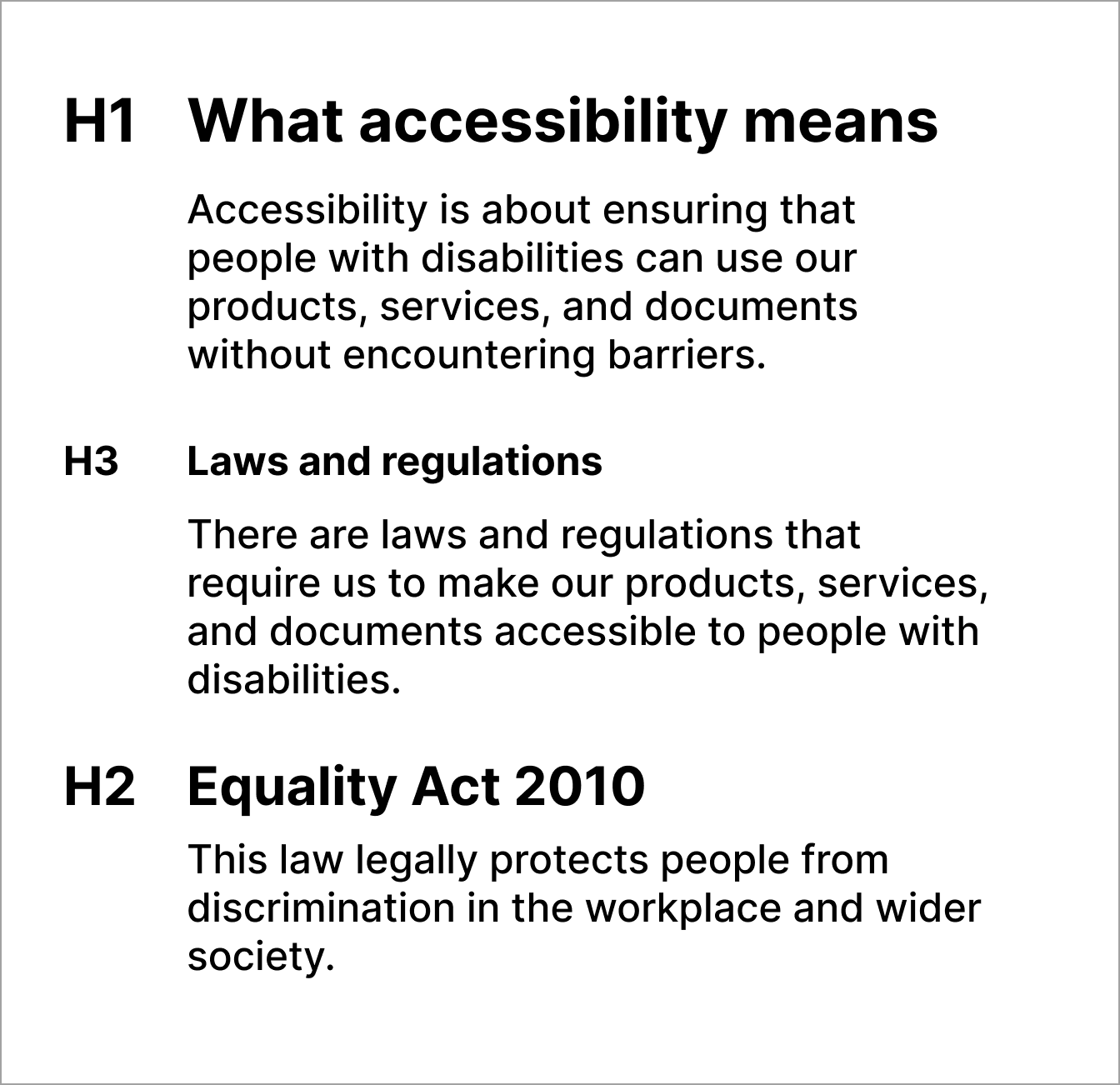
Skipped heading levels
Skipped heading levels can cause confusion, and from a semantic code perspective, is incorrect.
Structure headings in a logical order, for example, use H1 followed by H2, and H3.
Do
Use a logical heading structure which clearly shows the hierarchy of the page.
Don't
Do not skip heading levels, this is confusing and semantically incorrect.
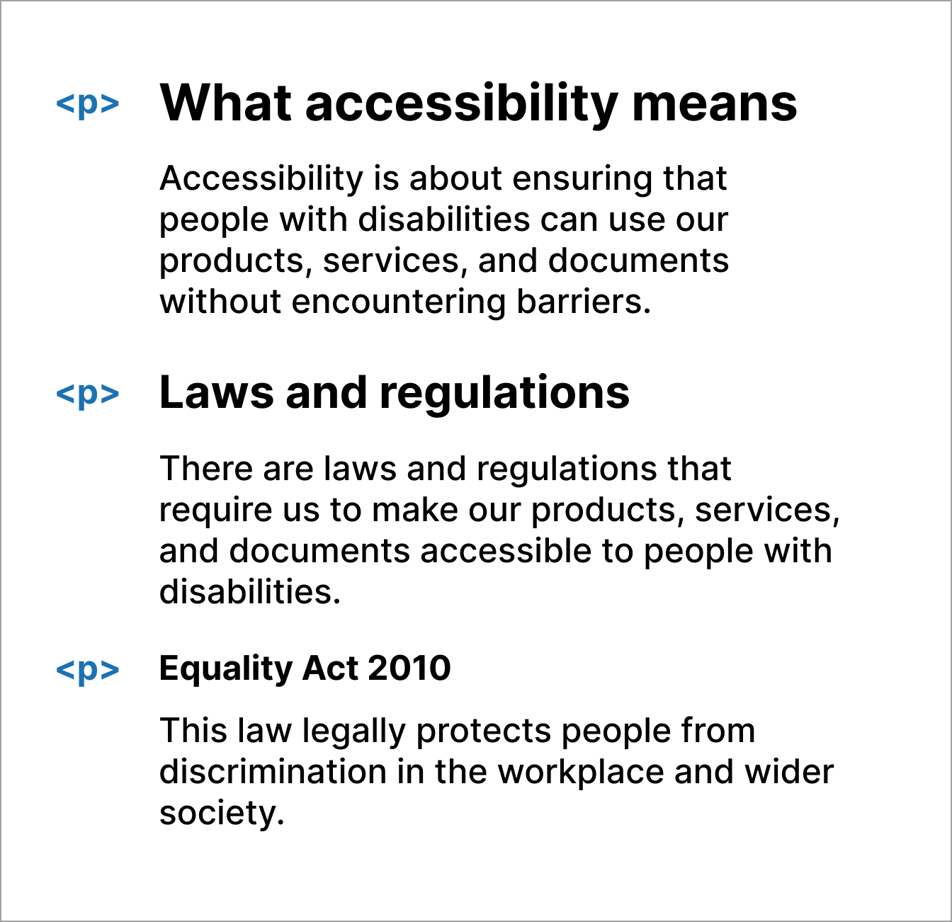
Use semantic heading structure
Use the correct code to create headings so that screen-reader users can navigate the page and understand the structure of the content.
Follow GOV.UK guidance for headings, which encourages the use of H1 to H3. If content appears to have a need to go beyond an H3, you should redesign it.
Do
Use correct HTML markup (H1, H2, H3) for headings.
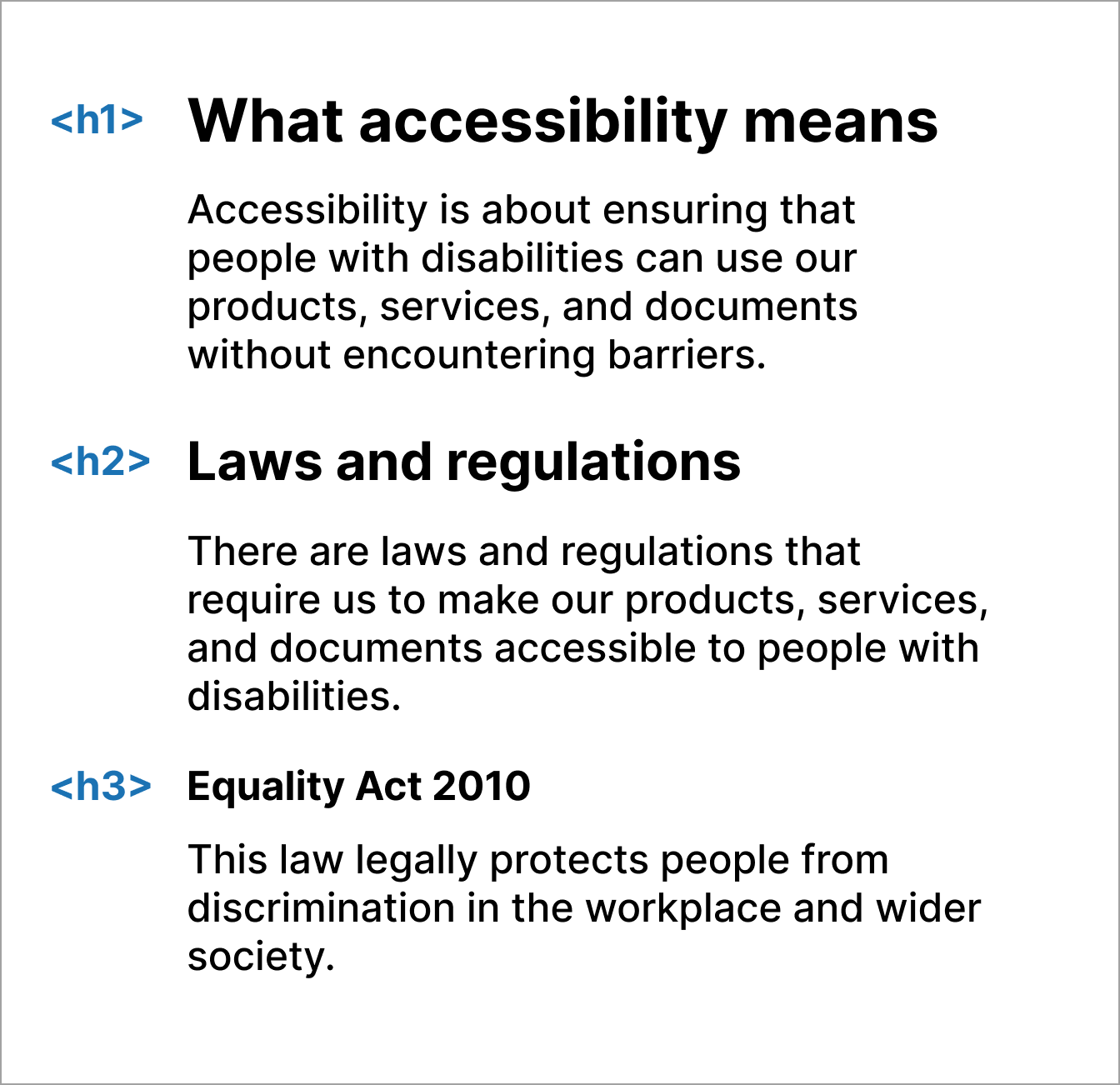
Don't
Do not style paragraphs or other elements to look like headings.
Images, charts and alt text
People with a sight impairment or are blind, rely on good alternative descriptions to understand non-text content.
Follow GOV.UK guidance to create accessible images.
Wrong alt text
When a user makes a mistake, it's important to provide a clear and concise error message that explains the problem and how to fix it. This will help users understand what they need to do to correct the error and continue with their task.
Do
Ensure alt text accurately describes the image.

alt="A teacher standing in front of a class of children who are sitting at desks."
Don't
Do not use the filename or misleading descriptions.
alt="image123"
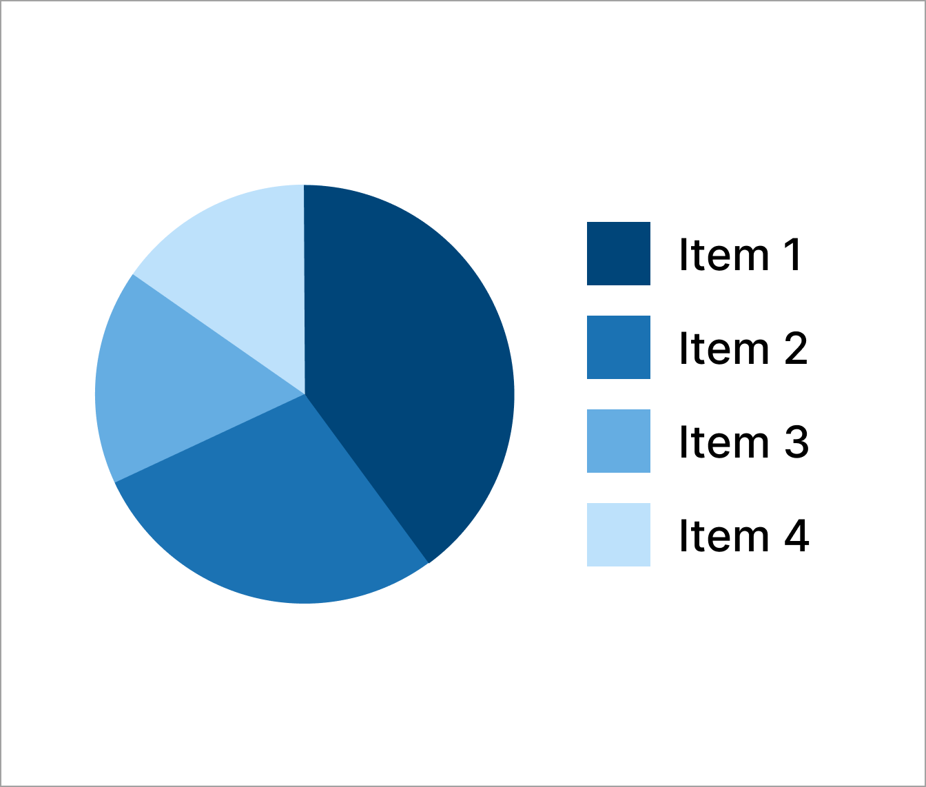
Chart data and labels
It's important to ensure that colour alone has not been used to provide information or descriptions. For users with colour deficiencies or colour blindness, this content can often not be understood.
Use the charts guidance in the DfE Design manual.
Do
Label charts with information and use a range of colours.
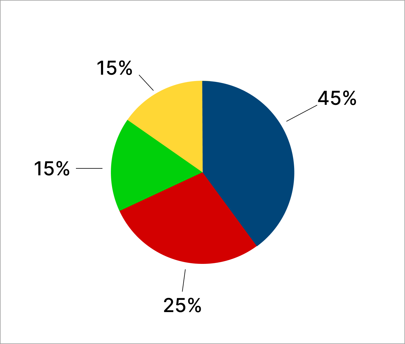
Don't
Do not use colour alone to represent data or a label for a chart.
Non-descriptive links
Some users, especially those using a screen reader, may navigate content by looking for links or viewing links in a list to try to find specific content.
If links are not unique or descriptive this can be frustrating.
Follow GOV.UK guidance to create accessible links.
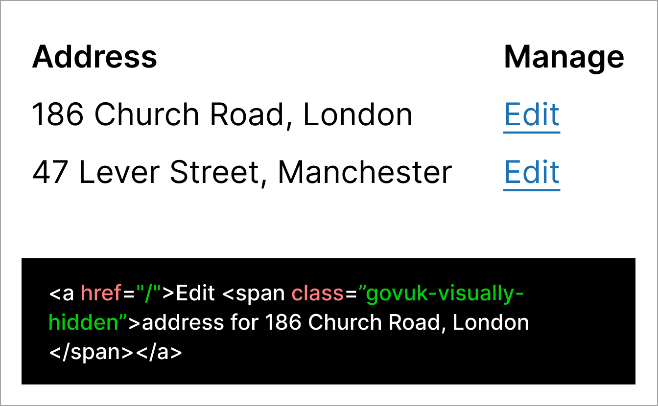
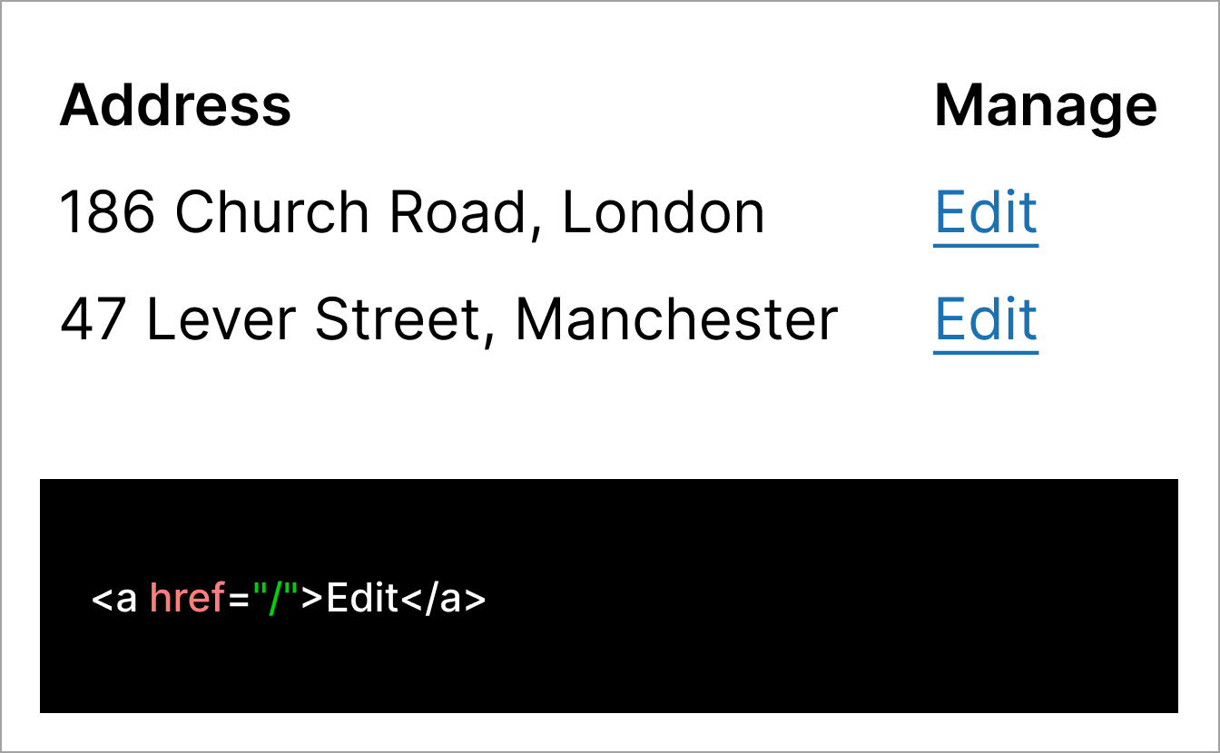
Repetitive links
In some cases, repetitive links are necessary, for example, in a table where actions may be required.
You can make links more useful by including visually-hidden text for each link, which supports screen-reader users to understand the context of the link.
This is particularly useful when designing Check your answers.
Do
Use hidden text to add extra information for the edit link.
Don't
Do not use generic content without additional context.
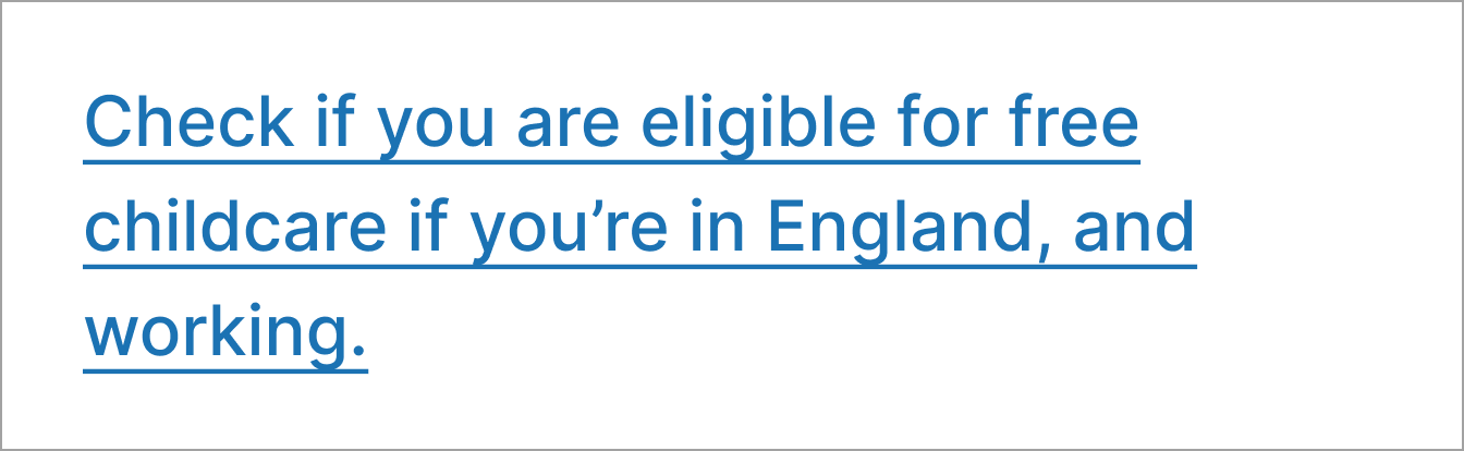
Non-descriptive links
If links are not unique or descriptive users will not know what to expect.
Do
Use inline links that are descriptive and unique.
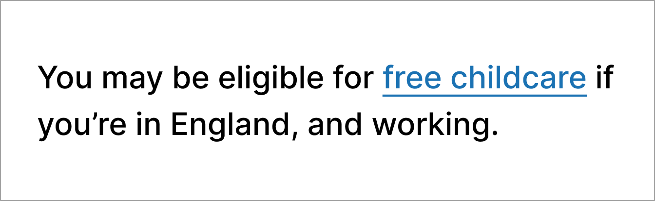
Don't
Do not link long sentences or provide more information than necessary.
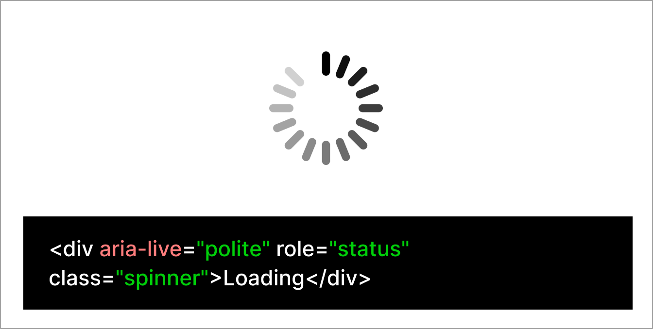
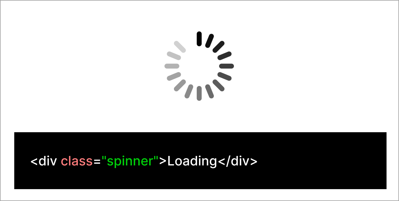
Status changes to content
When JavaScript is used to update content on a page, sighted users can see the changes.
For users who are blind, have low vision, use a screen reader, or magnifier, these changes need to be communicated in other ways.
For example, when a page is loading, usually a visual spinning circle can be seen by default, this update will not be provided to screen readers.
How to prevent issues
ARIA live regions are one way changes to content can be provided to screen readers. Ensure the correct live region is provided depending on the type of change.
Incorrect implementation of ARIA can sometimes make a user experience worse. If you need advice on how to implement ARIA live regions, contact DesignOps.
Find more information about ARIA live regions on the Mozilla Developer Network.
Changes to content not provided to screen readers
Do
Use ARIA attributes to tell screen readers about content changes.
Don't
Do not rely on icons alone to alert users to changes on a page.
Using colour
DfE digital services should follow GOV.UK guidance for colour.
Campaign sites using a different colour palette can get support from DigiComms (open DfE intranet) and the Government Communication Service (GCS).
Text contrast
Low text contrast can make content difficult to read, especially for people with sight impairments or colour deficiencies.
Ensure text and background colours have a contrast ratio of at least 4.5:1 for normal text and 3:1 for large text.
Check the contrast ratio of your text and background colours using the Contrast Checker tool.
Do
Use foreground and background colours that sufficiently contrast.

Don't
Do not use light text on pale backgrounds that makes content difficult to read.

Non-text contrast
Checking the non-text contrast ratio on each page of your product or website ensures that users with low vision or a colour deficiency can perceive parts of the screen that may not be text but are still important for accessing and understanding content.
Non-text contrast has a minimum requirement of a 3:1 contrast ratio. You can use the Contrast Checker to check this.
Do
Ensure elements like buttons sufficiently contrast against the page background.

Don't
Do not use colours that make it difficult to identify an element against a background.

Focus state
Focus states help users know they're on an interactive element, like a link or a form input. They're important for people who use a keyboard to navigate, and for those with low vision or a colour deficiency.
If the foreground and background colours do not have enough contrast, users with low vision or a colour deficiency may not see the name of the link.
Changing the style of the focus state when designing services using the GOV.UK Design System and GOV.UK Frontend can confuse people.
Do
Use the default GOV.UK Design System styling for focus states.
Don't
Do not change the colour or style of focus states.